Case Studies & UI Architectures
Explore an interactive breakdown of my core design projects. Toggles between case studies and navigate through the presentation decks below.
Smart Art Application
Empowering local female creators and disrupting mass-import gifting with strict authentication guardrails.
The Challenge
The UK spends over £5 billion annually on low-cost imported parcels. During peak gifting seasons, billions are spent on mass-produced items that end up unused. Meanwhile, many highly talented women with incredible crafting skills are trapped outside the traditional workforce due to family commitments. How can we connect them with local buyers looking for genuine handmade gifts?
Key UX Solutions
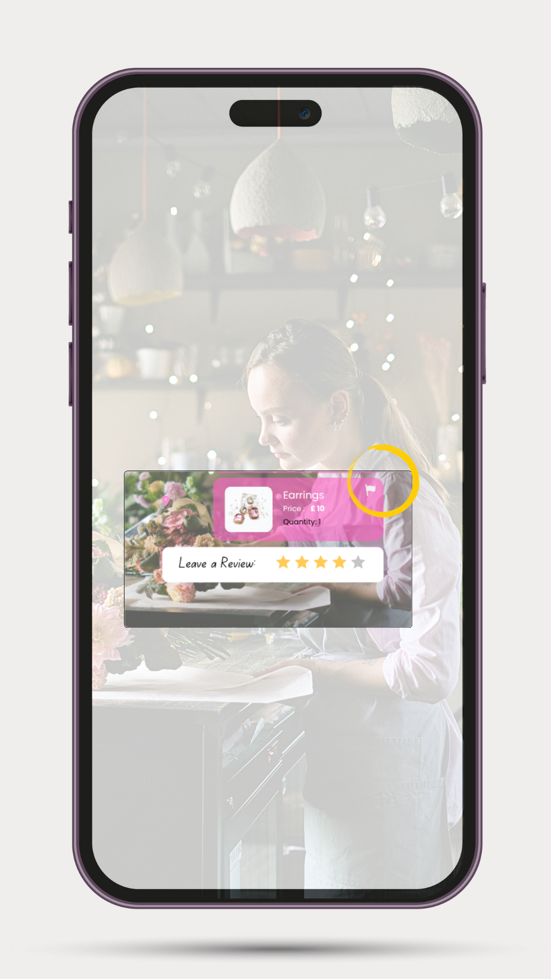
Platforms like Etsy have lost consumer trust, flooded with mass-produced items from sites like Temu. This dilutes the space for authentic creators.
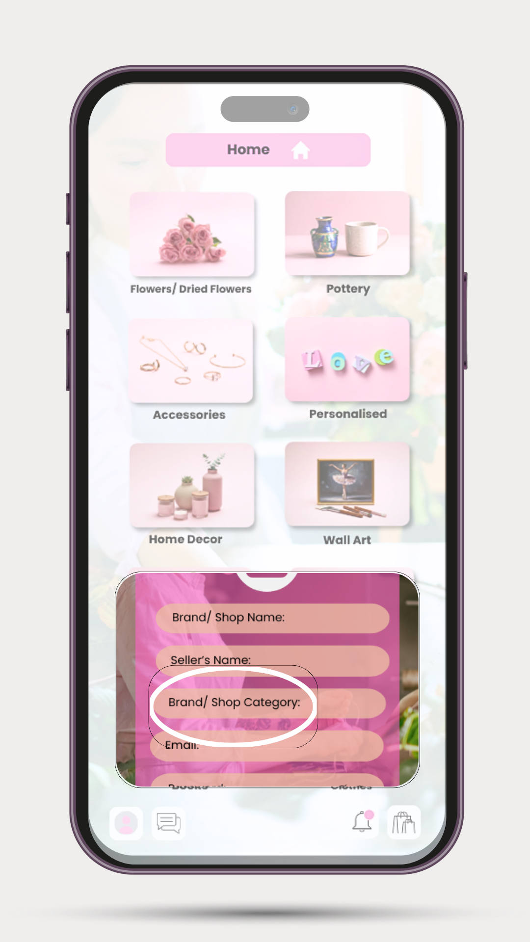
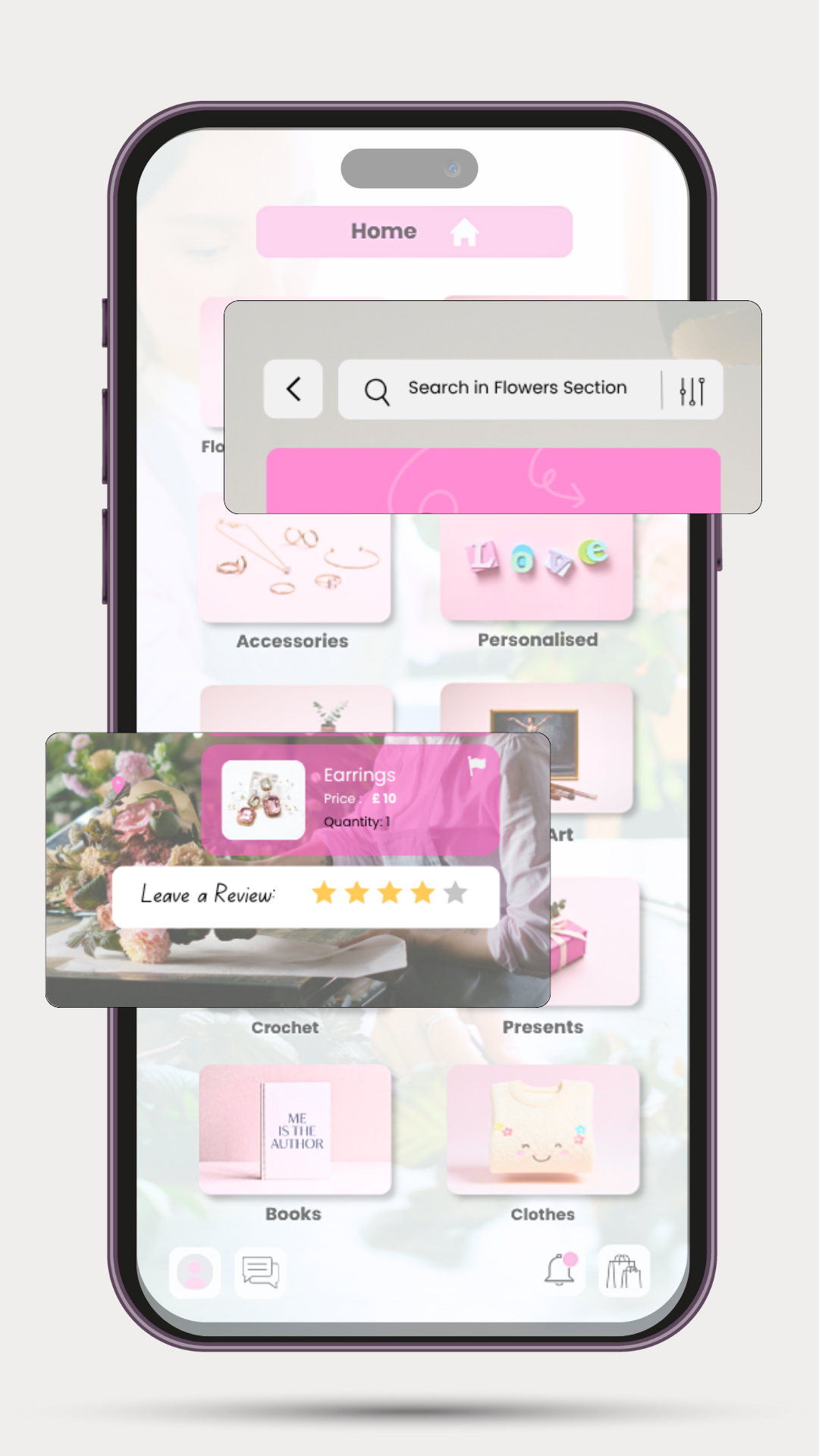
Smart Art enforces strict verification and shop restrictions for resellers. The homepage starts with clean craft categories rather than random grids, removing visual noise and guiding buyers intentionally.
B2B Supply Roadmap
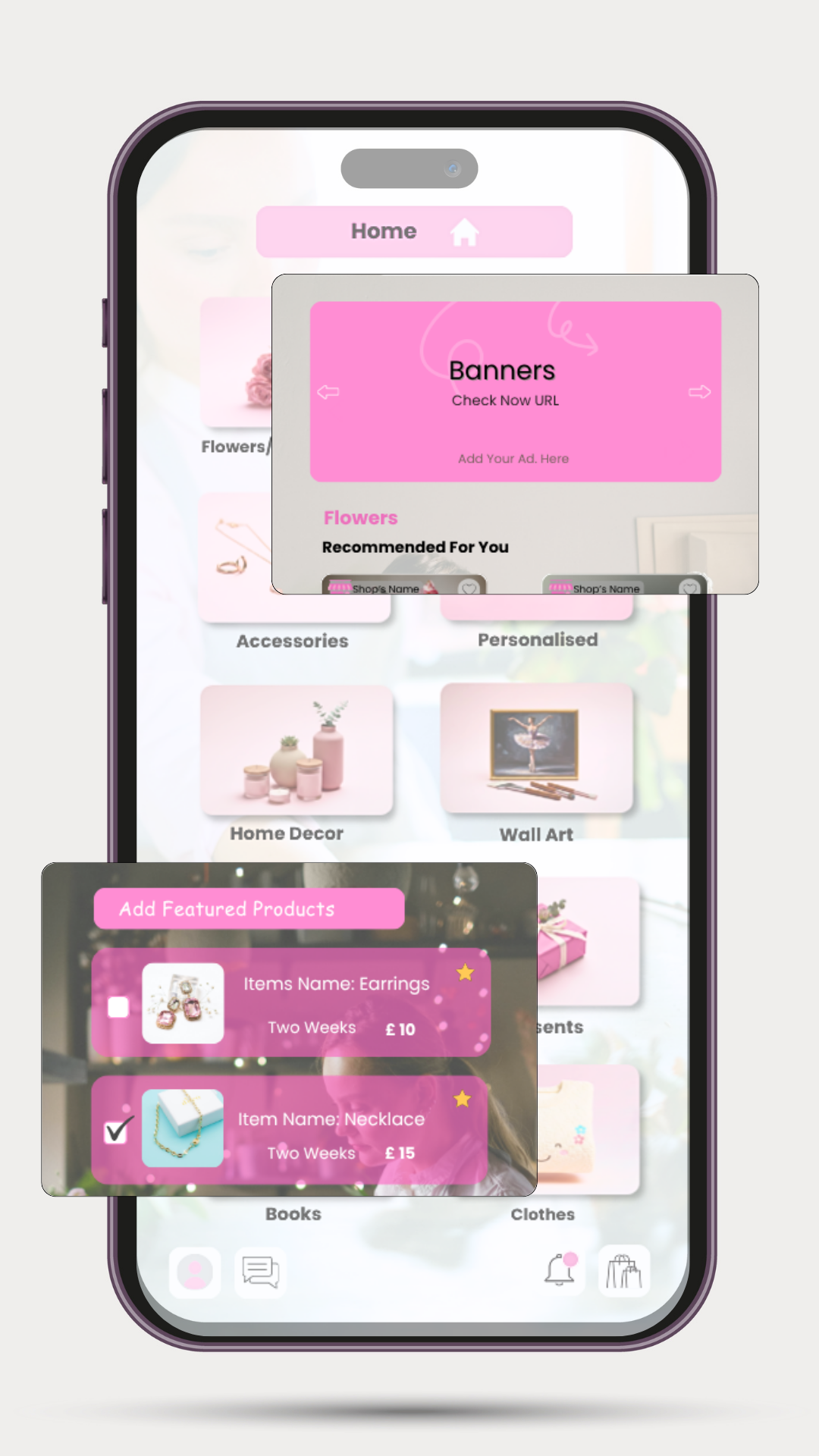
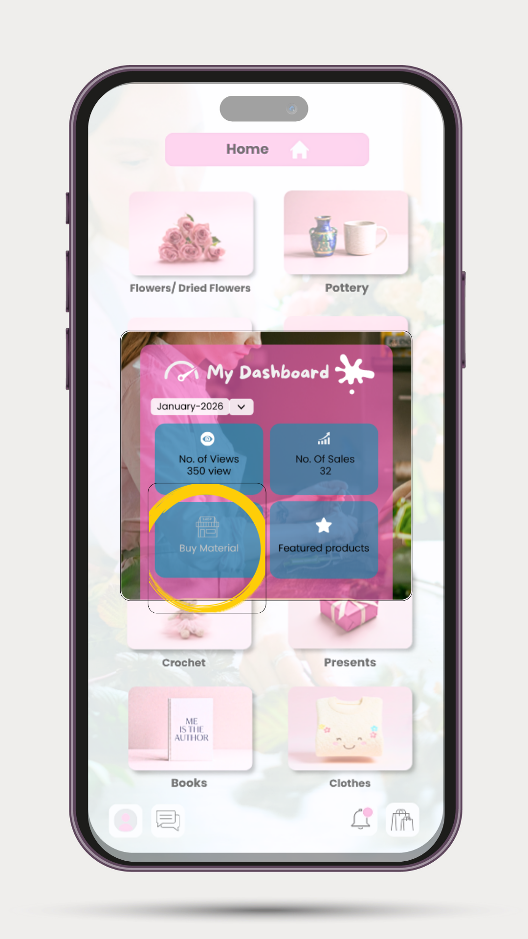
To ensure financial sustainability, the roadmap introduces a wholesale raw materials shop built directly into the seller's portal. Creators can purchase supplies (yarn, kits, paints, candle wax) in bulk at competitive prices—lowering production expenses and increasing profit margins, while establishing a B2B revenue stream for Smart Art.
NHS Mobile App Optimization
Optimizing accessibility, information architecture, and high-stress workflows for millions of patients.
The UX Challenge
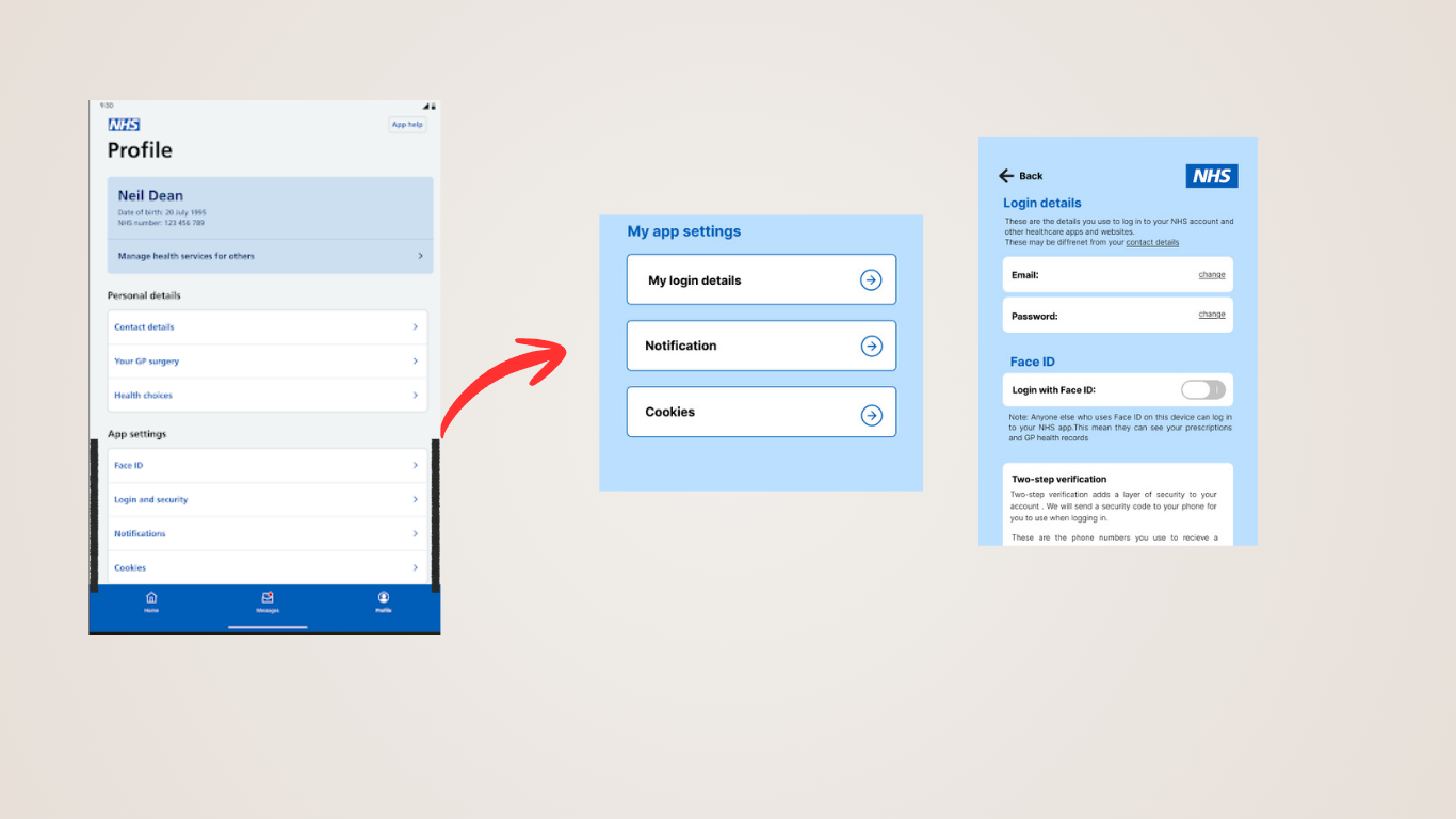
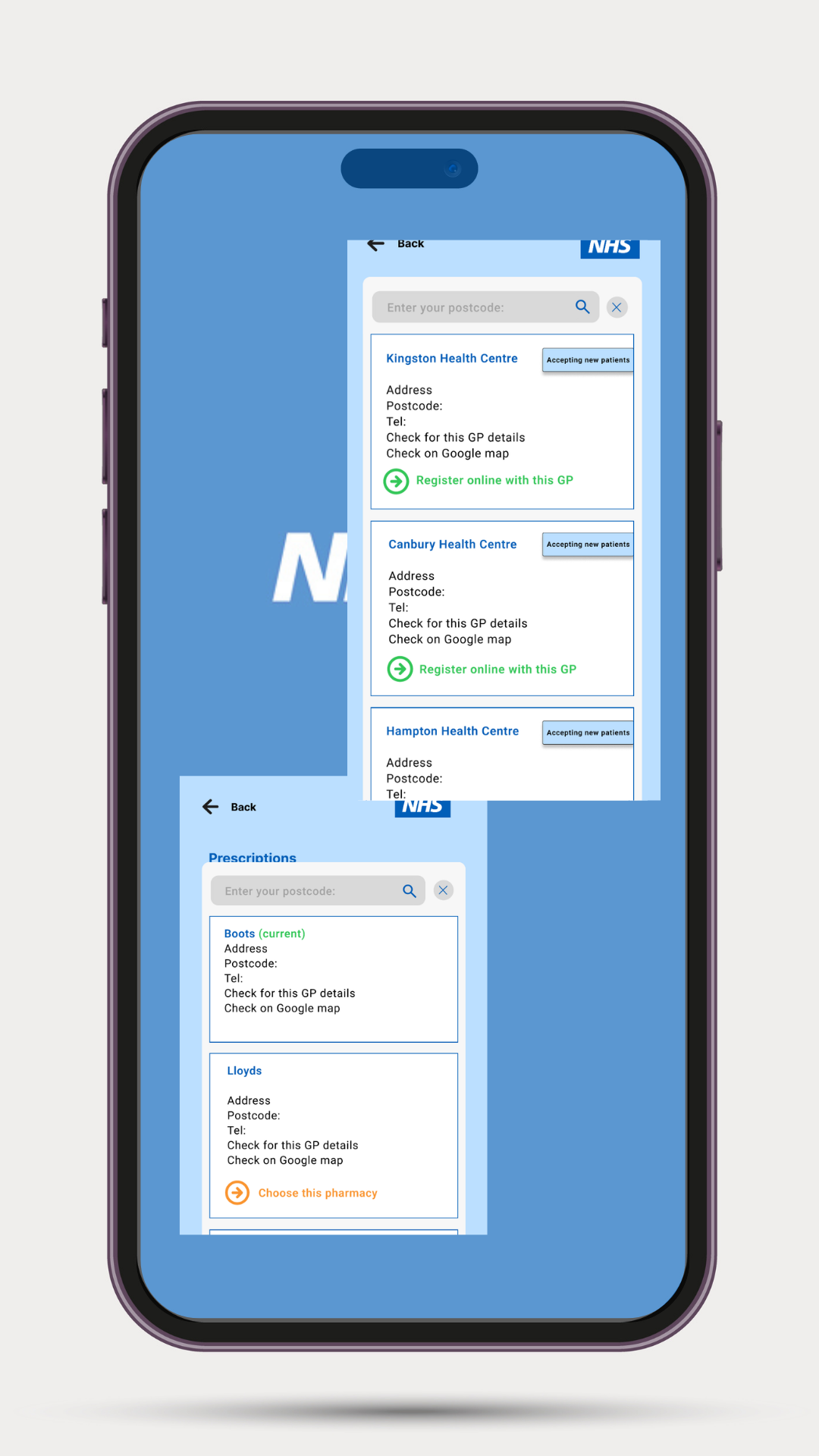
Healthcare applications serve the most diverse user base imaginable—from tech-savvy young adults to elderly patients with visual or cognitive impairments. Users are often in high-stress states. The challenge was to design complex data states (like blood metrics or prescription history) into intuitive, high-accessibility UI components while strictly maintaining NHS Manual compliance.
Key UX Interventions
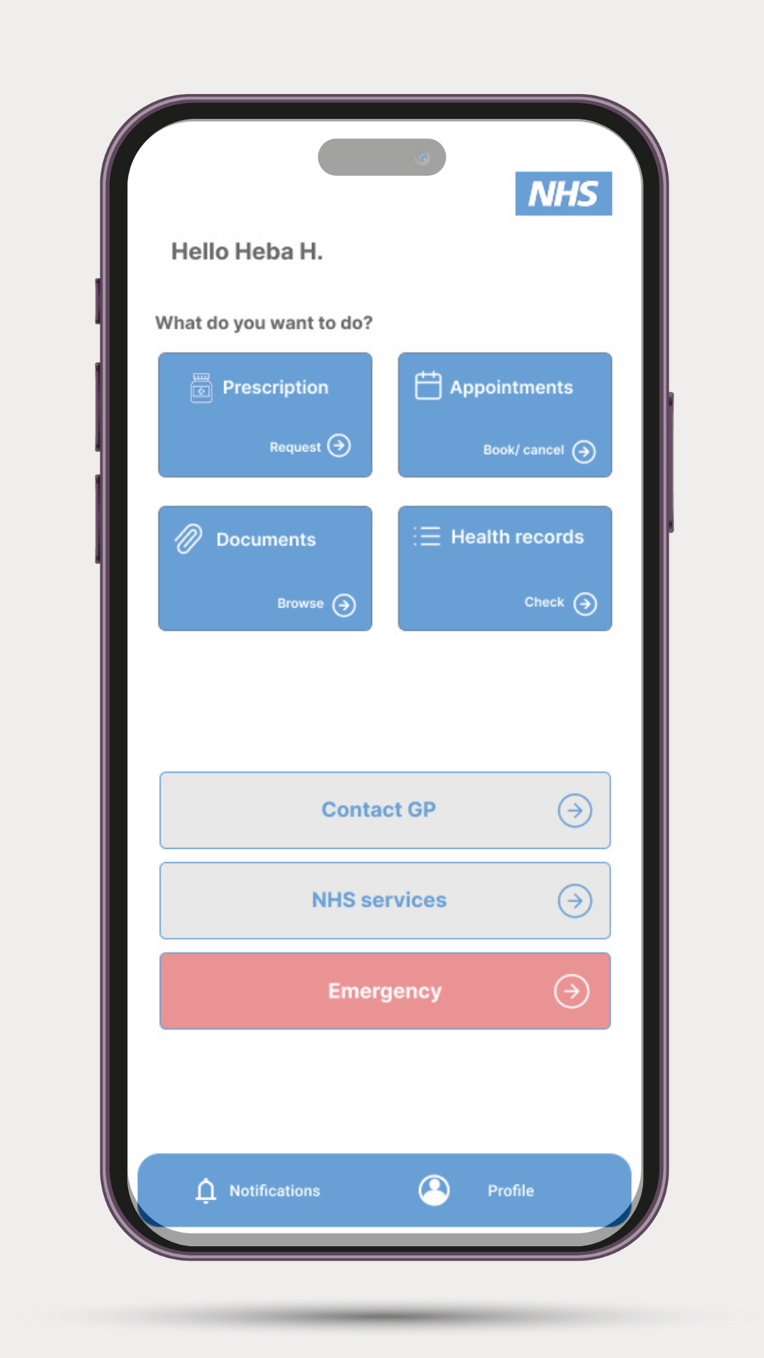
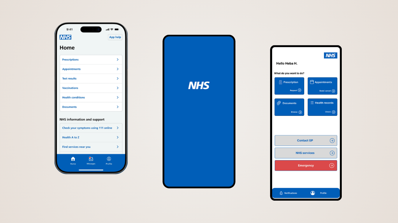
The current NHS App home screen relies on a flat, uniform vertical list where booking appointments, viewing letters, and emergency functions are visually identical, causing scrolling fatigue.
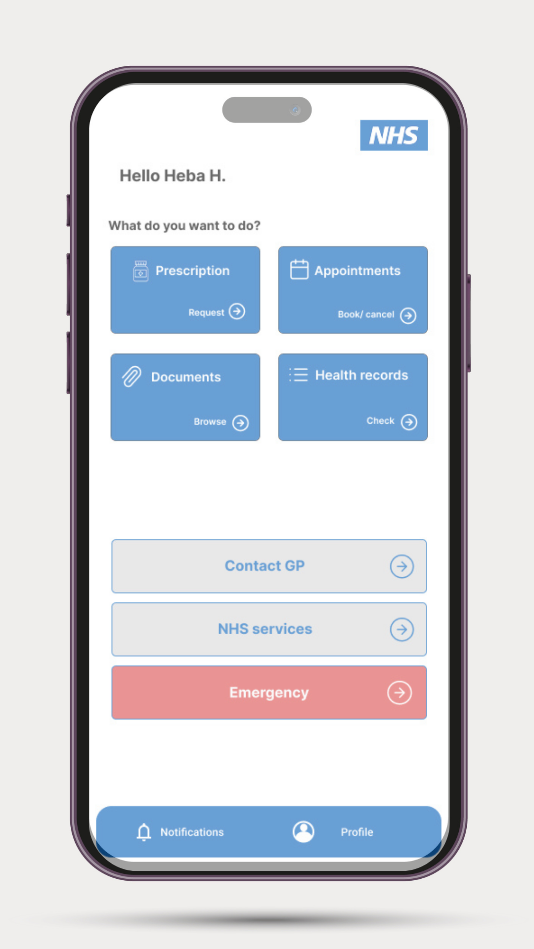
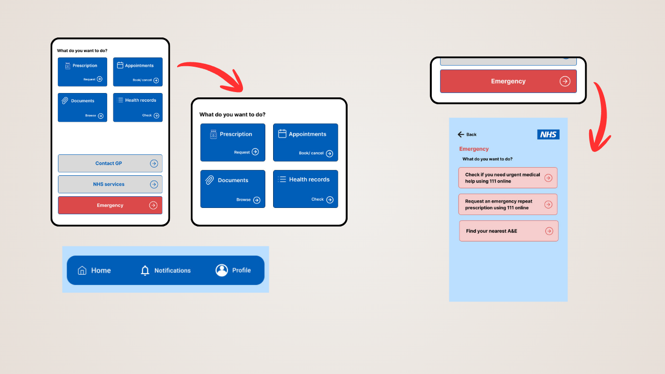
Created prominent, full-width Action Cards at the top for appointment booking and repeat prescriptions. Added a dedicated red-colored Emergency Card that COMMANDS attention during panic (leveraging narrow peripheral vision color psychology).
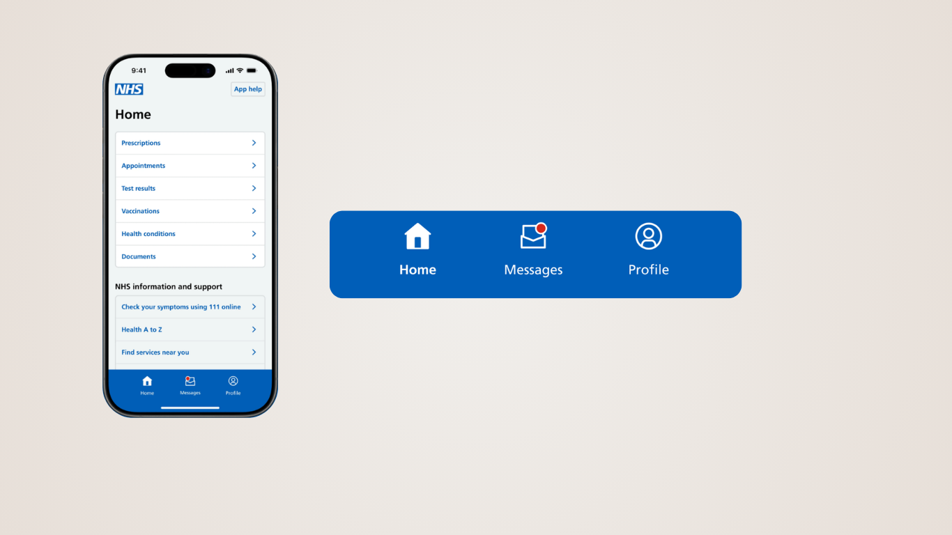
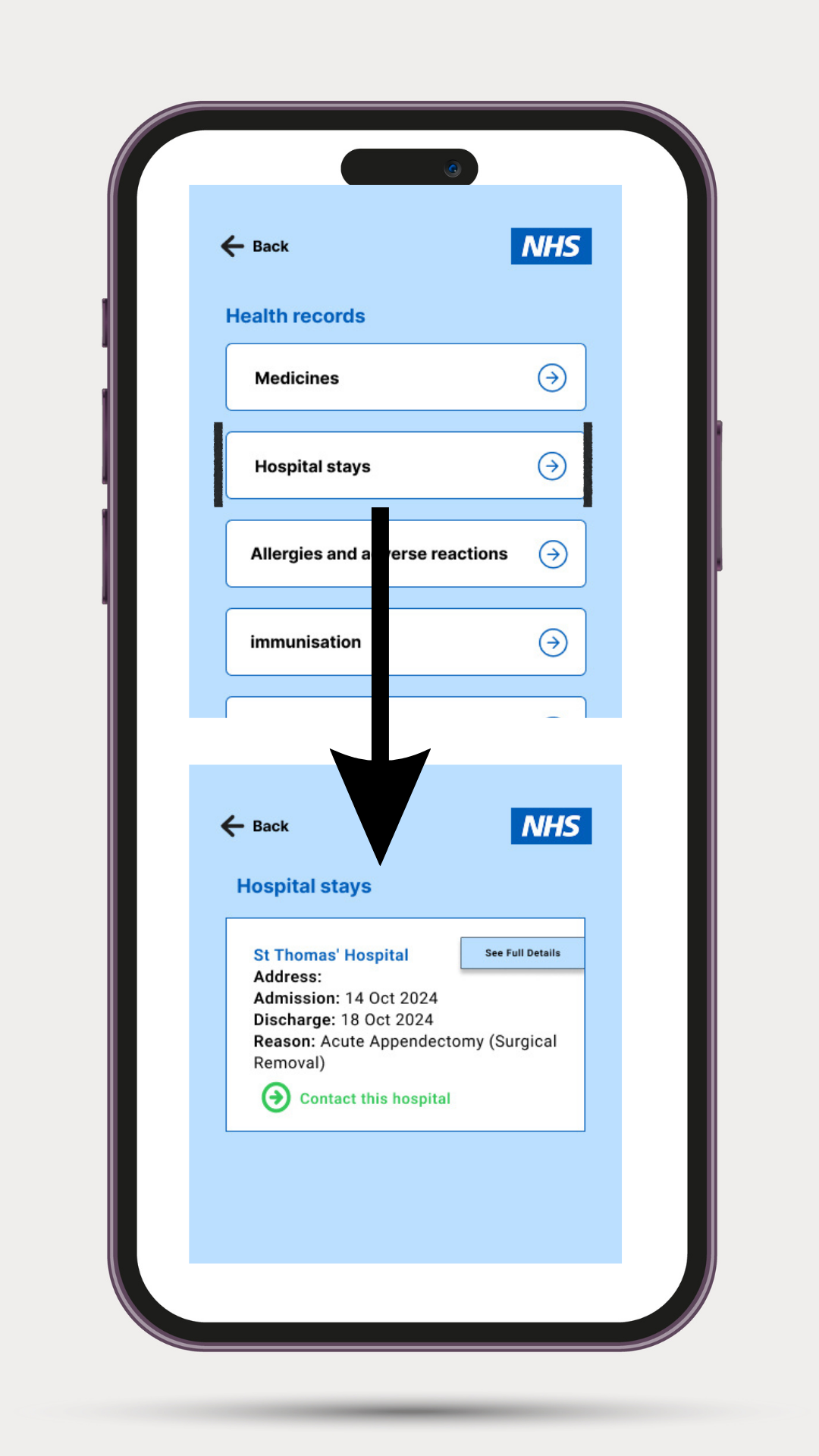
Transactional alerts (e.g. prescription ready) were mixed with permanent GP documents. The app was also read-only, forcing patients to call busy clinics for missing letters.
Divided the structure into real-time 'Notifications' and a permanent 'Documents' archive. Added a secure 'Request Letter' guided messaging box directly inside the document archive, enabling direct two-way requests and reducing telephone wait queues.
Applying Intentional Color Psychology
In medical emergencies, panic impairs a user's peripheral vision. Utilizing red for the Emergency Card Command Center acts as a universal visual shorthand for urgency. This calculated departure from NHS's standard calm-blue layout shifts the app from a passive reading portal into an active, life-saving guide.
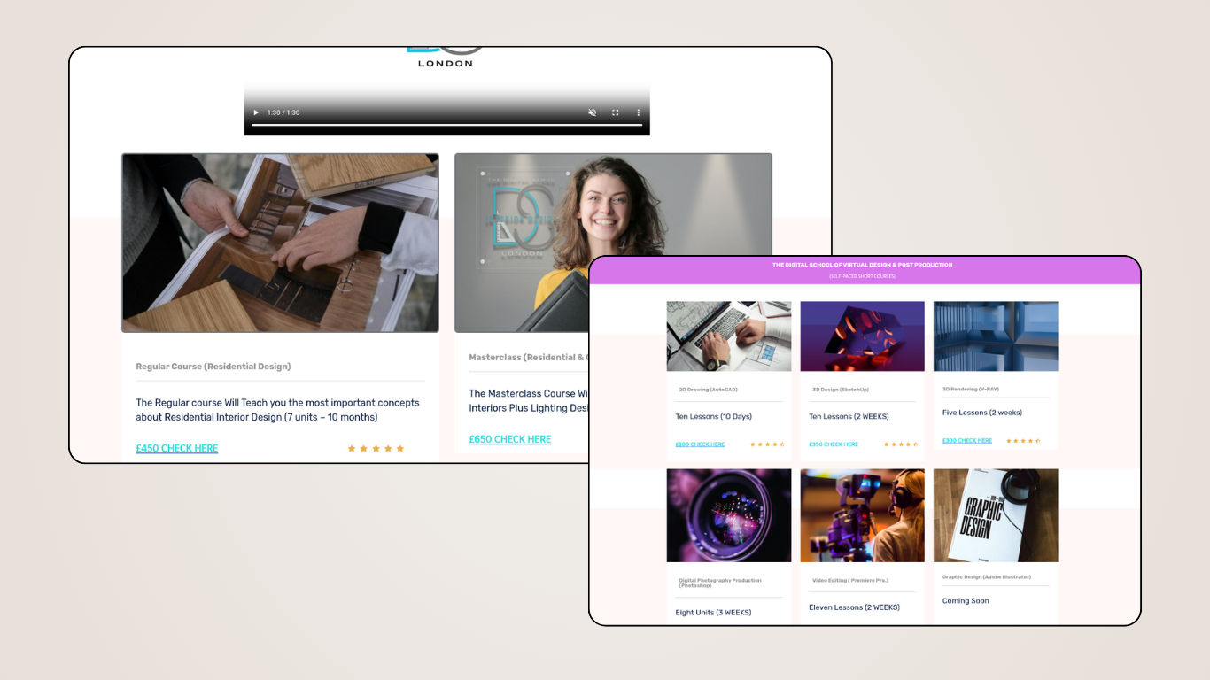
The Digital School Website
Designing a modern, distraction-free digital ecosystem for global online design and business education.
The Challenge
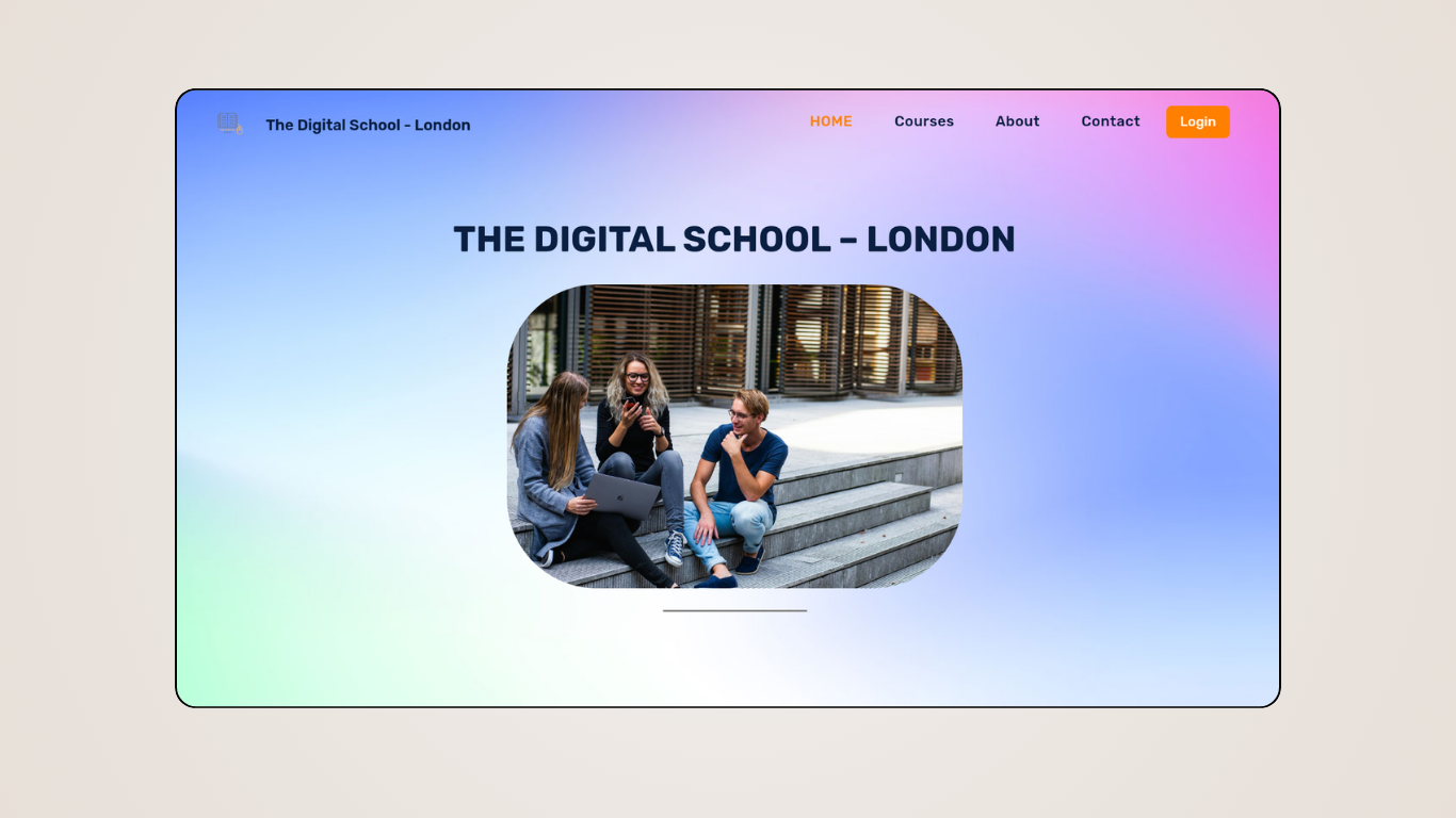
To transform a vast, extensive educational repository into an elegant, user-friendly digital space. The goal was to build an interface that immediately establishes academic trust, accommodates diverse creative domains (from Interior Design to Digital Marketing), and removes friction from the student enrollment path.
Design Strategy
Online learning options can feel scattered and disjointed, confusing prospective students and lowering course completion rates.
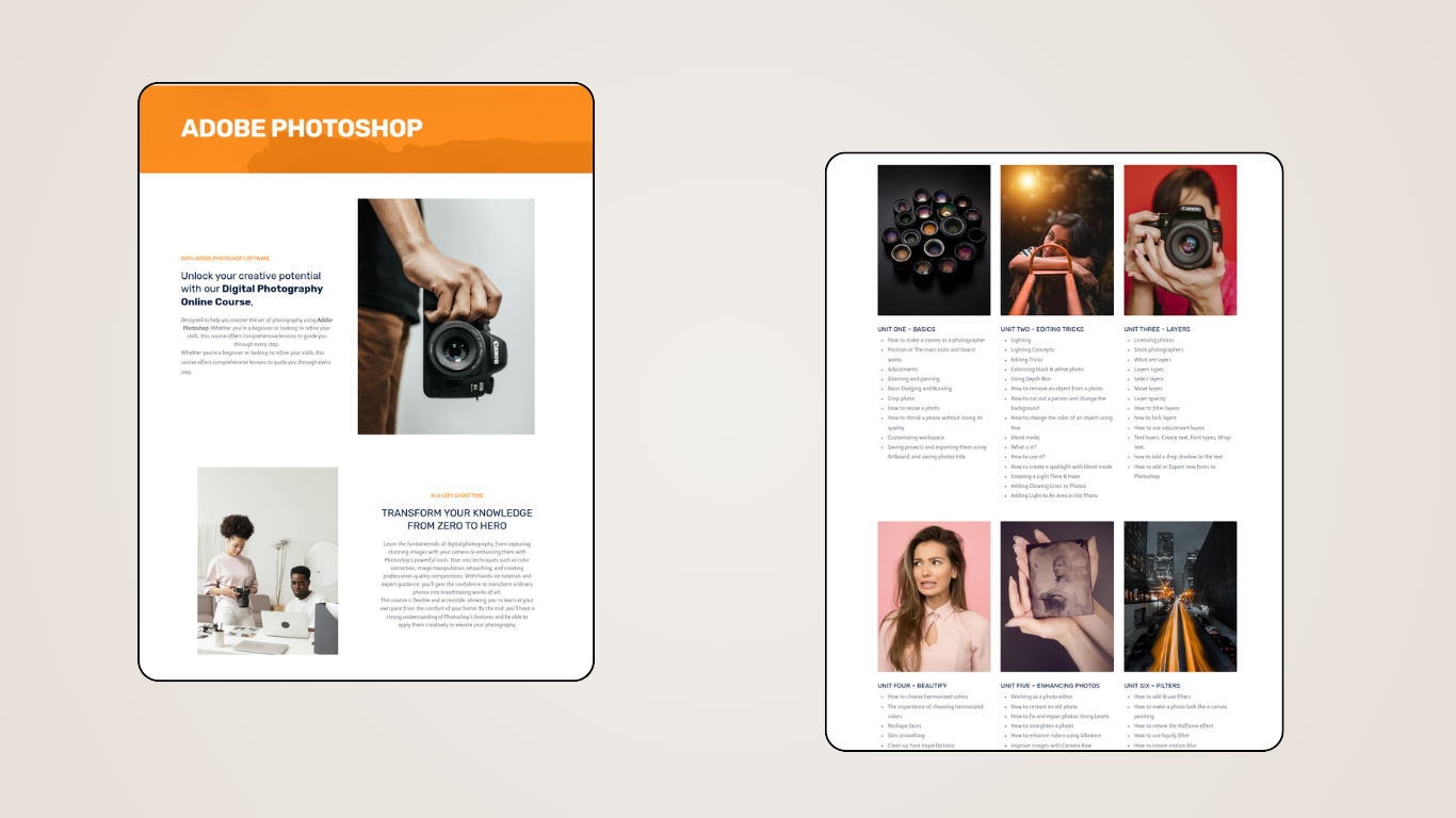
Segmented users instantly via domain-specific portals (Creative Arts vs Corporate). Custom-designed frontend dashboards featuring unit-by-unit progress trackers to make complex materials feel snackable.
Visual Trust Triggers
The design system utilizes strict, responsive grids with generous white space and high-readability sans-serif font pairings. To reassure global applicants of the school's UK-standard quality, we designed dedicated, highly polished UI blocks highlighting student success metrics and expert panels.
Editorial Presentation Layouts
Visual editor transforming unstructured files into an editorial-grade corporate asset.
The Editorial Strategy
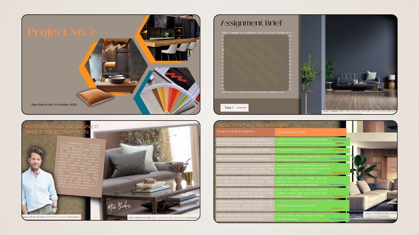
When formatting a massive 80-slide project deck, the primary goal is to establish structural consistency while actively reducing cognitive load for the viewer. The work focused on grid alignment, geometric balance, and mathematical consistency in paddings, transforming a dense content dump into a polished studio-grade corporate deck.
Key Layout Systems
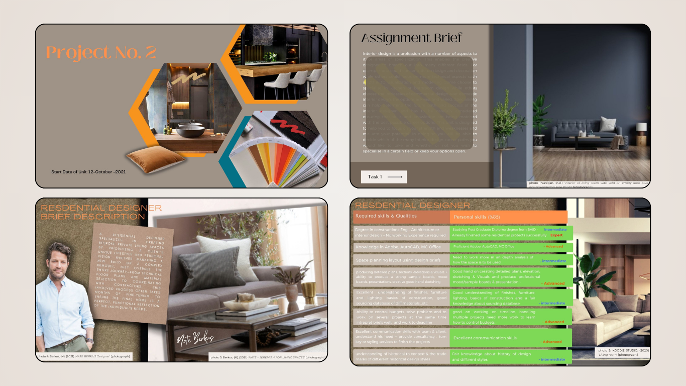
Dense multi-row skill lists and tables are difficult to absorb quickly, increasing viewer cognitive fatigue during corporate pitches.
Refactored tables into clean dashboard matrices with warm terracotta headers and green status indicators. Engineered an asymmetric layout system balancing overlapping photographic frames and editorial margins.
Strategic Takeaway
This project demonstrates high-end systems thinking and information mapping. Maintaining mathematical alignment in margins and visual elements ensures readability across heavy data layers, making corporate presentations look cohesive and professional.